What kind of visual do you choose for your gym, or your company, or yourself ? Do you choose images and fonts that are common in your sector ? Do you try to look like all your competitors ?
OR do you try to look different ? In the last issue of Fast Company, David Lidsky writes : “In today’s culture, where there are 100 brands of breakfast cereal in every aisle of everything in life, being distinctive – as company, as professional – is everything“.
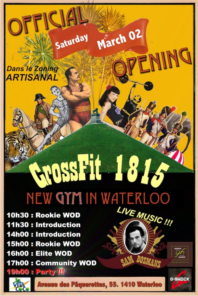
To announce the official opening of CrossFit 1815 (Waterloo, Belgium), we created a visual for social media, inspired by vintage circus posters. So far from the typical gym and fitness posters.
Think that your media (posters, flyers, videos…) must be as different from what your competitors do, as your product or service is…
And it’s the same as individual (freelance or even employee). That’s exactly what I noticed when I was teaching : your class could be unique, if you’re unique as teacher.


